Re-brand or de-brand?
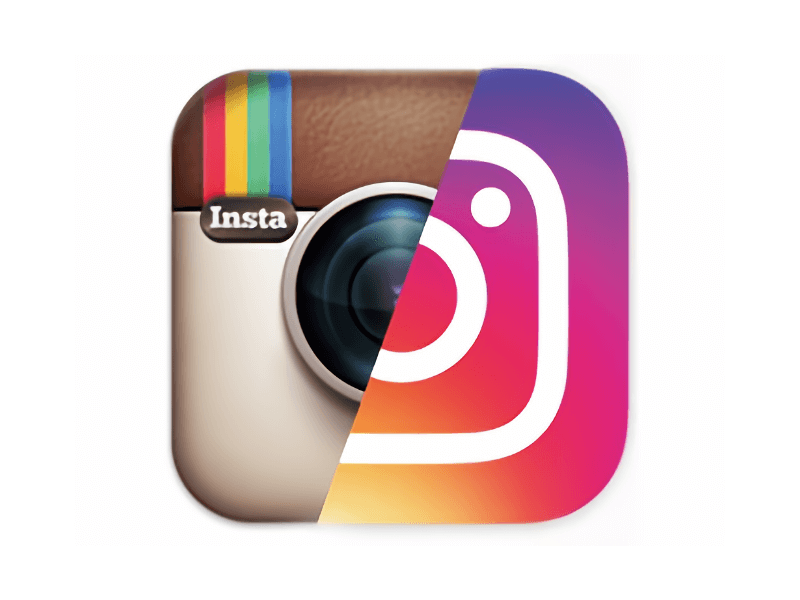
In May 2016, Instagram released a re-design and new look. Its retro camera icon, with which users had quickly and easily identified for years, was flattened, and a bright rainbow gradient added behind it. Its colorful and oversimplified elements came as quite a surprise.
By Michael Pfeffer
Senior Graphic Designer
In May 2016, Instagram released a re-design and new look. Its retro camera icon, with which users had quickly and easily identified for years, was flattened, and a bright rainbow gradient added behind it. Its colorful and oversimplified elements came as quite a surprise.
The new icon is clearly part of the trend towards flat design—a minimalist user interface genre used in web and mobile apps—that has been around longer than Instagram itself.

Modern day flat design, which was introduced by Microsoft and popularized by Apple and Google, has become a very familiar sight over the past decade. Even the latest versions of Microsoft Windows and Mac OS X have gone flat. Such is its popularity that established brands, such as Hershey’s and Mini, have simplified and flattened their logos.
As big brands go flat, Instagram, among others, has taken it a step further by adopting gradients and bright colors. Spotify is one brand that has done this long before Instagram.
But why did Instagram jump onboard? And why now?
After five years of holding out, refusing to go mainstream, Instagram appears to be looking to expand its user base. Since Facebook acquired the firm, in 2012, it’s been steering the app in a more lucrative direction.
It also added a group of companion apps, including Hyperlapse, Layout, and Boomerang, which have a consistent look to their parent, Instagram. This appears to be one reason for the rebranding.
Within hours of the move, users were quick to comment online. Referring to the new logo, the words “hate it” appear much more often than “like it.” Many expressed disappointment, saying the app’s identity has been lost.
The reaction (or some might say over-reaction) to the new icon could be an indication not only of feelings about the icon itself but also about flat design. While flattening and simplifying a logo can make it appear modern and mainstream, it can also result in the loss of its distinctive qualities.
Changing the icon was a bold move but it could be seen as relatively safe in terms of rebranding. A more radical move may have been to go against the mainstream. Imagine if Instagram had instead kept the retro icon, and added embellishments to it.
For established brands, following the trend is not always the best course. Logos and icons can be tweaked to make them feel more modern without confusing customers or risking a loss of brand equity.