West Canada Homes
Building a new visual identity for a leading project manager of luxury homes
Founded more than 25 years ago, West Canada Homes (WCH) is one of the leading real estate project management companies in the premier ski resort area of Niseko in Hokkaido. Over the past decades, the area has transformed from a quiet, out-of-the-way location to a destination for high-net-worth individuals from around the world. Many of them have chosen the area as the location to build luxurious properties that combine architectural excellence, top-quality furnishings, and stunning views of the local scenery.
Through word of mouth and a dedication to improving their craft in all aspects of their work, WCH has become the go-to source for those people who want to build truly outstanding homes in the region. However, their existing brand identity and marketing assets were outdated and didn’t reflect the sophistication of their work—or their clientele. So they came to Custom Media.

In beginning our collaboration with WCH, we conducted a series of workshops to identify five primary concepts that guided us. The first was “special moments,” reflecting the fact that their clients choose to celebrate holidays and other occasions that are important to them and their families at their homes. “Luxury” speaks for itself: the properties that WCH creates for their clients represent the best that money can buy, inside and out. As the company works with a variety of artisans who are responsible for creating elements of the houses they project manage, and they continuously work on improving their processes, “craftsmanship” was another key concept. These properties are primarily vacation homes, so the idea of “getaway” was a central point. Finally, WCH wanted to include some element of the founder’s home country in their identity; therefore, communicating a sense of “Canada” was important.
We conducted extensive research on their competitors in the market—including the strengths and weaknesses of their visual identities—and studied the approaches of other companies around the world that specialize in creating homes in resort areas. Visiting the properties in Niseko first hand, and having the opportunity to stay in one of them, gave us an intimate understanding of what makes WCH’s properties unique.
This extensive research and face-to-face experience with the WCH team—and the properties they have created—led to our insight that they needed a visual identity that was fresh, sophisticated, and impactful, and our development of their strikingly new brand and visual identity.

It begins with the logo mark, which was designed to be impactful and memorable. The combination of round and sharp corners and crafted modern lettering are a testament to the sophisticated approach of WCH and the outstanding properties they create. Meanwhile, the colors and brand application were carefully crafted to reflect the high level of quality that their customers expect.
Along with the dynamic logo, we established clear and comprehensive guidelines for how the logo and associated visual elements could be used. We used these to smoothly roll out a wide array of collateral, including black business cards—which featured striking red printed edges—as well as stationery, advertisements, and even vehicle decals.

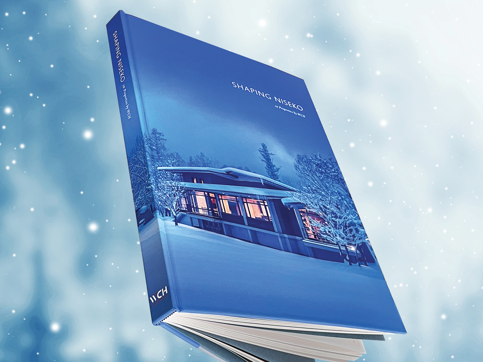
Based on the brand identity, we created what will be one of WCH’s grandest marketing assets: a 240-page coffee table book. It is filled with stunning photographs that depict the homes, from their impressive exterior designs to the painstakingly chosen details—ranging from the craftwork of Japanese artisans to pieces by world-renowned furniture makers—within the properties themselves. This expansive work is a hallmark example of visual storytelling and will be used in meetings with prospective clients and distributed to luxury hotels and sold in bookstores.

Going beyond just layout for this element of the project, we considered how people would interact with the book, and what materials—such as paper types, fabric, and the fine details of binding—best reflected the concept of luxury that is at the heart of WCH’s brand. In particular, we pored over hundreds of samples before deciding on the fabric for the hard cover, much in the same way WCH chooses furniture and furnishings for their clients. The book stands out for its careful and harmonious balance of text and imagery; meanwhile, architectural plans and sketches were incorporated in a consistent way, which meant going a step beyond what was needed, often recreating floor plans to simplify them and match the style of the book. To punctuate the space between chapters, we used paper that was reminiscent of traditional Japanese washi paper as dividers. And in recognition of WCH’s craftsmanship, an entire chapter is dedicated to the work of the Japanese artisans whose work features at the properties.
I think the new identity is bold and strong. It assists in reflecting to clients that we’re not stagnant, and we’re willing to change with the times, while not forgetting about what got us here in the first place … The feedback has been entirely positive. And I think the book will be outstanding—the images, the text, and the layout. It’ll go a long way to further represent the quality of our company.
To accompany the book, we created a captivating bespoke website that encompassed the new brand identity and reimagined the visual storytelling of the book in a digital format.

For WCH, the rebrand and marketing assets have proved integral in helping to raise its stature and further promote its services among its target market in the Asia–Pacific region. For us, the project allowed us to harness our extensive experience in the real estate sector, and our strengths in targeting wealthy expats in Japan.
With thoughtfulness, style, and a keen sense of design, we crafted a brand image that brought their sophistication, craftsmanship, and dedication to their craft to life and gave them the tools to convey their passion and expertise to their target audience.